Dawn is Shopify’s free reference theme, and many other themes are built on it. It has no dark mode toggle for shoppers, but its color system makes dark mode easy to add. This guide covers three approaches, from simplest to most flexible.
The code in this guide was tested against Dawn 16 and covers Dawn 10 and later. Those versions all use the same color scheme system. Dawn 13 and later name the schemes scheme-1 to scheme-5. Dawn 10 to 12 named them background-1, background-2, inverse, accent-1, and accent-2.
Option 1: Make Dawn dark with a color scheme (no code)
If you want your whole store to be dark for every visitor, you don’t need any code.
- Go to Online Store > Themes and click Customize on Dawn.
- Click the gear icon to open Theme settings, then open Colors.
- Dawn ships with five color schemes. The first one is the default for most sections. Edit it:
- Background: a dark color, for example
#121212 - Background gradient: leave empty. A gradient replaces the background color where it is set.
- Text: a light color, for example
#EDEDED - Solid button background: a light color, for example
#EDEDED - Solid button label: a dark color, for example
#121212 - Outline button: a light color
- Background: a dark color, for example
- Click through your header, announcement bar, footer, and any section that uses another scheme, and set them to the scheme you just edited.
- Save.
That’s it. The downside is that the store is now dark for everyone, with no way for shoppers to switch back to light.
Option 2: Add a light/dark toggle with code
To keep Dawn light by default and let shoppers switch, override Dawn’s color variables when dark mode is on.
How Dawn’s colors work
Dawn writes each color scheme into CSS variables in layout/theme.liquid. The variables hold plain RGB values, not full colors:
:root,
.color-scheme-1 {
  --color-background: 255,255,255;
  --color-foreground: 18,18,18;
  --color-button: 18,18,18;
  --color-button-text: 255,255,255;
  /* ... */
}
The rest of the theme uses them as rgb(var(--color-background)). Because every section reads from these variables, you can switch the whole store to dark by redefining them under one attribute on the <html> element.
Before editing code, duplicate your theme (Online Store > Themes > … > Duplicate) and make your changes on the copy. Publish it once you’ve tested everything.
Step 1: Create a dark mode snippet
Go to Online Store > Themes > … > Edit code. In the Snippets folder, add a new snippet called dark-mode and paste this:
<script>
  (function () {
    try {
      var saved = localStorage.getItem('theme');
      var prefersDark = window.matchMedia('(prefers-color-scheme: dark)').matches;
      if (saved === 'dark' || (!saved && prefersDark)) {
        document.documentElement.setAttribute('data-theme', 'dark');
      }
    } catch (e) {}
  })();
</script>

<style>
  html[data-theme='dark'],
  html[data-theme='dark'] [class*='color-scheme-'],
  html[data-theme='dark'] .color-background-1,
  html[data-theme='dark'] .color-background-2,
  html[data-theme='dark'] .color-inverse,
  html[data-theme='dark'] .color-accent-1,
  html[data-theme='dark'] .color-accent-2 {
    --color-background: 18,18,18;
    --gradient-background: rgb(18,18,18);
    --color-foreground: 237,237,237;
    --color-background-contrast: 60,60,60;
    --color-shadow: 0,0,0;
    --color-button: 237,237,237;
    --color-button-text: 18,18,18;
    --color-secondary-button: 18,18,18;
    --color-secondary-button-text: 237,237,237;
    --color-link: 237,237,237;
    --color-badge-foreground: 237,237,237;
    --color-badge-background: 18,18,18;
    --color-badge-border: 237,237,237;
  }

  html[data-theme='dark'] .header__heading-logo {
    filter: invert(1) hue-rotate(180deg);
  }

  .dark-mode-toggle {
    position: fixed;
    right: 20px;
    bottom: 20px;
    z-index: 100;
    width: 44px;
    height: 44px;
    border-radius: 50%;
    border: 1px solid rgba(var(--color-foreground), 0.2);
    background: rgb(var(--color-background));
    color: rgb(var(--color-foreground));
    font-size: 20px;
    cursor: pointer;
  }
</style>
The script runs before the page is drawn. It turns dark mode on if the shopper chose it before, or, on a first visit, if their device is set to dark mode. This prevents a white flash on page load.
The CSS replaces every Dawn color scheme with one dark palette. The selector list covers both the new and the old scheme names. If you added your own schemes on an older Dawn version, add their .color-… classes too. The CSS also inverts the header logo, so a dark logo stays visible. Remove that rule if your logo is already light.
Step 2: Load the snippet in the head
Open layout/theme.liquid. Find the line containing {{ content_for_header }} and add this line directly below it:
{% render 'dark-mode' %}
Step 3: Add the toggle button
Still in layout/theme.liquid, add this just before the closing </body> tag:
<button type="button" class="dark-mode-toggle" aria-label="Toggle dark mode">◐</button>
<script>
  document.querySelector('.dark-mode-toggle').addEventListener('click', function () {
    var root = document.documentElement;
    var isDark = root.getAttribute('data-theme') === 'dark';
    if (isDark) {
      root.removeAttribute('data-theme');
    } else {
      root.setAttribute('data-theme', 'dark');
    }
    try {
      localStorage.setItem('theme', isDark ? 'light' : 'dark');
    } catch (e) {}
  });
</script>
Save, then preview the theme. Click the button in the bottom right to switch modes, then reload the page. Your choice should stick.
What this code doesn’t cover
This is a solid starting point, but expect to adjust a few things:
- Images with white backgrounds stay white. That’s usually fine for product photos. Don’t invert them.
- Sections with custom colors, such as a promo banner with a hard-coded color, need their own rules.
- App widgets (reviews, chat, popups) use their own styles and won’t follow Dawn’s variables.
- The button design is basic. You might want a sun/moon icon, or to move it into the header.
- Theme updates. When you update Dawn to a new version, you’ll need to add the snippet and button again.
For a more detailed walkthrough of the toggle logic, including a three-way Light / Dark / Auto switch, see How to add a dark mode toggle button to Shopify.
Option 3: Use a dark mode app (no code, with a toggle)
If you want the toggle without maintaining theme code, an app is the fastest route. NightTheme works with Dawn through an app embed, so your theme files stay untouched:
- Install NightTheme from the Shopify App Store.
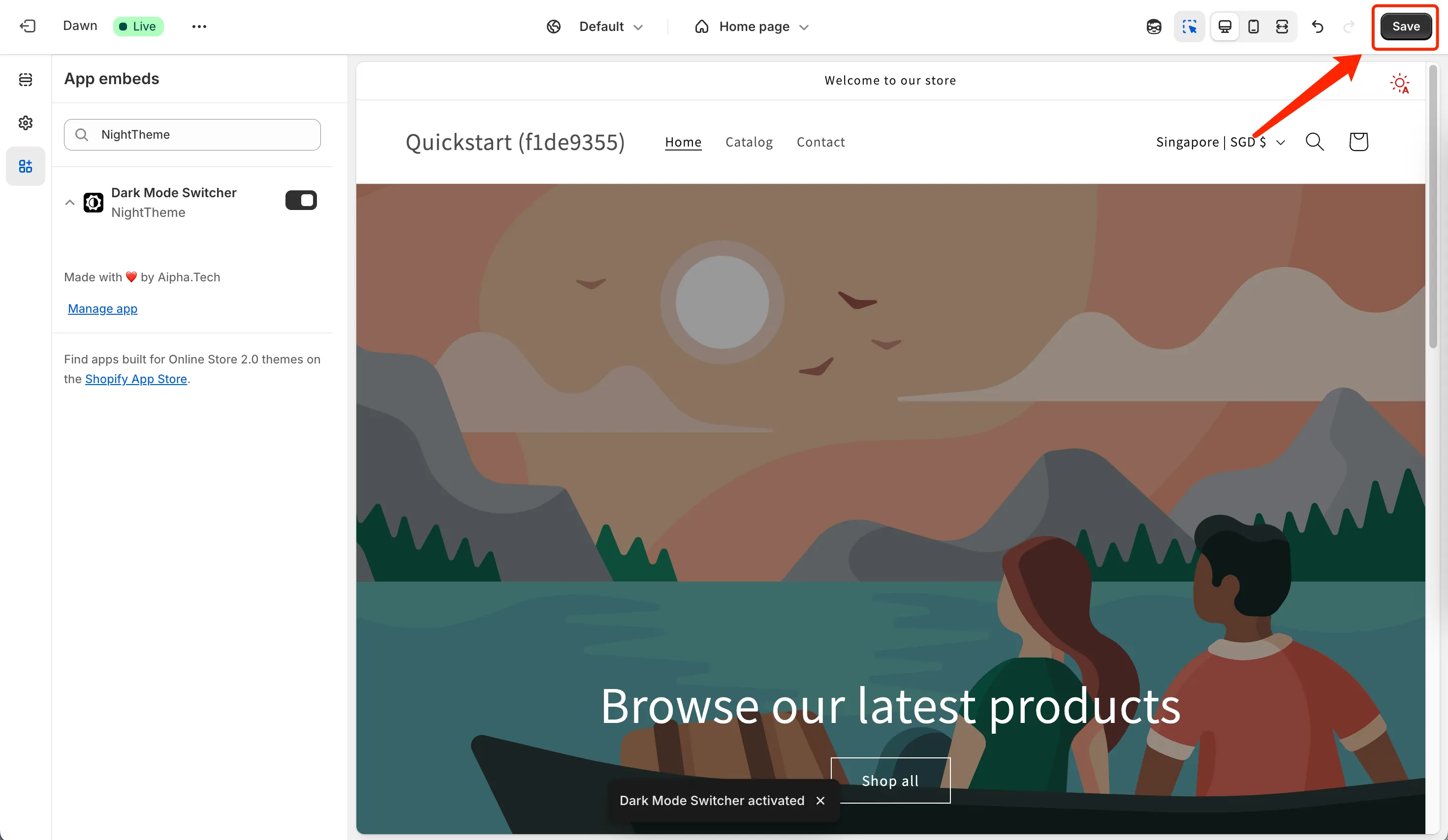
- In the app, click the button to open the theme editor. Under App embeds, make sure Dark Mode Switcher is on, then click Save.
- Set where the switch appears (separately for desktop and mobile), its size, style, and color.
- Choose the default mode: Light, Dark, or Auto.
- Preview dark mode on your own Dawn storefront, then turn it on for shoppers.
If your logo disappears in dark mode, add its selector (.header__heading-logo in Dawn) to NightTheme’s invert selector. For anything else that needs adjusting, add dark-mode-only CSS in the app’s advanced settings.
Summary
| Color scheme | Custom code | NightTheme app | |
|---|---|---|---|
| Shopper toggle | No | Yes | Yes |
| Auto (follow device) | No | Yes | Yes |
| Code required | No | Yes | No |
| Survives theme updates | Yes | No, re-add after updating | Yes |
| Cost | Free | Free | Paid, free trial |
If you just want a dark store, use a color scheme. If you want shoppers to choose and you’re comfortable with code, use the snippet above. If you want the toggle without the maintenance, try an app.
More Shopify dark mode guides
- Shopify Dark Mode: 3 Ways to Add It to Your Store Compare the three ways to add dark mode to a Shopify store: a dark color scheme, a custom-coded toggle, or an app. Includes setup steps and a checklist.
- How to Add a Dark Mode Toggle Button to Shopify Add a Light / Dark / Auto toggle to any Shopify theme: remember the shopper's choice, follow their device setting, and avoid the white flash on page load. Code included.
- Logo Disappears in Dark Mode on Shopify? 4 Ways to Fix It A dark logo vanishes on a dark background. Four ways to keep your Shopify logo visible in dark mode: invert it with CSS, swap in a light version, add a backdrop, or use an app setting.