A dark mode toggle lets shoppers switch your store between light and dark. That’s different from making your store permanently dark with your theme’s color settings, which everyone sees. If permanent dark is all you need, see Method 1 in our Shopify dark mode guide.
This guide shows how to build a proper toggle with code, then how to get the same result without code.
What a good dark mode toggle does
A toggle that only swaps colors on click feels broken. A good one also:
- Remembers the choice. If a shopper picks dark, every page and every later visit stays dark.
- Follows the device setting. An Auto option matches the shopper’s system preference (
prefers-color-scheme), and updates if they change it. - Doesn’t flash. Dark mode is applied before the page is drawn, so dark mode users don’t see a white flash on every page load.
- Is easy to find but not in the way. Usually a small floating button in a corner, or an icon in the header.
- Keeps the store readable. Buttons, prices, badges, and forms all keep enough contrast.
The code below handles points 1 to 4. Point 5 depends on your theme’s colors.
Before editing code, duplicate your theme (Online Store > Themes > … > Duplicate) and work on the copy.
Step 1: Apply the saved mode before the page renders
Go to Online Store > Themes > … > Edit code, open layout/theme.liquid, and paste this inside <head>, directly below {{ content_for_header }}:
<script>
  (function () {
    var mode = 'auto';
    try { mode = localStorage.getItem('color-mode') || 'auto'; } catch (e) {}
    var media = window.matchMedia('(prefers-color-scheme: dark)');
    function apply() {
      var dark = mode === 'dark' || (mode === 'auto' && media.matches);
      document.documentElement.setAttribute('data-theme', dark ? 'dark' : 'light');
      document.documentElement.setAttribute('data-color-mode', mode);
    }
    apply();
    media.addEventListener('change', function () { if (mode === 'auto') apply(); });
    window.setColorMode = function (next) {
      mode = next;
      try { localStorage.setItem('color-mode', next); } catch (e) {}
      apply();
    };
  })();
</script>
This script is small and runs immediately, so the right mode is set before anything is drawn. It also exposes setColorMode('light' | 'dark' | 'auto') for the toggle to call.
Step 2: Define your dark colors
Now tell the theme what dark mode looks like, using the data-theme="dark" attribute on <html>.
If your theme uses CSS variables for colors (Dawn and most Online Store 2.0 themes do), override those variables. This is the cleanest approach because the whole theme updates at once. For Dawn and Dawn-based themes, the complete variable list is in our Dawn dark mode guide. For other themes, open layout/theme.liquid or the theme’s main CSS file and look for a :root { … } block with variables like --color-background or --color-text.
A generic example:
<style>
  html[data-theme='dark'] {
    --color-background: #121212;
    --color-text: #ededed;
    color-scheme: dark;
  }
</style>
color-scheme: dark tells the browser to draw native elements in dark style too, such as scrollbars and some form controls.
If your theme doesn’t use variables, a common shortcut is to invert the whole page and then re-invert media so photos look normal:
<style>
  html[data-theme='dark'] {
    filter: invert(1) hue-rotate(180deg);
    background: #fff;
  }
  html[data-theme='dark'] img,
  html[data-theme='dark'] video,
  html[data-theme='dark'] iframe {
    filter: invert(1) hue-rotate(180deg);
  }
</style>
It works in minutes, but brand colors shift, shadows can look strange, and background images set in CSS get inverted. Treat it as a quick test rather than a final solution.
Step 3: Add the toggle
Paste this just before </body> in layout/theme.liquid. It adds a three-way Light / Auto / Dark switch in the bottom right corner:
<div class="color-mode-toggle" role="group" aria-label="Color mode">
  <button type="button" data-mode="light" aria-label="Light mode">☀</button>
  <button type="button" data-mode="auto" aria-label="Match device">◐</button>
  <button type="button" data-mode="dark" aria-label="Dark mode">☾</button>
</div>

<style>
  .color-mode-toggle {
    position: fixed;
    right: 20px;
    bottom: 20px;
    z-index: 100;
    display: flex;
    gap: 2px;
    padding: 4px;
    border-radius: 999px;
    background: #f2f2f2;
    box-shadow: 0 2px 8px rgba(0, 0, 0, 0.15);
  }
  html[data-theme='dark'] .color-mode-toggle {
    background: #2a2a2a;
  }
  .color-mode-toggle button {
    width: 34px;
    height: 34px;
    border: 0;
    border-radius: 50%;
    background: transparent;
    color: inherit;
    font-size: 16px;
    cursor: pointer;
  }
  html[data-color-mode='light'] [data-mode='light'],
  html[data-color-mode='auto'] [data-mode='auto'],
  html[data-color-mode='dark'] [data-mode='dark'] {
    background: #0076fc;
    color: #fff;
  }
</style>

<script>
  document.querySelectorAll('.color-mode-toggle [data-mode]').forEach(function (button) {
    button.addEventListener('click', function () {
      window.setColorMode(button.getAttribute('data-mode'));
    });
  });
</script>
If you use the invert shortcut from Step 2, the toggle gets inverted too, so you may want to swap its colors.
Save and preview. Test these four things:
- Click Dark, then open another page. It should stay dark, with no white flash.
- Click Auto, then change your computer’s or phone’s appearance setting. The store should follow.
- Click Light. The store should stay light even if your device is in dark mode.
- Check it on a phone. The toggle shouldn’t cover your cart button, chat bubble, or cookie banner.
Common problems
The page flashes white before turning dark. The Step 1 script isn’t in <head>, or it’s loaded with defer or async. It must be an inline script near the top of the head.
Some sections stay light. Those sections set their own colors. Find their class names with your browser’s inspector and add rules under html[data-theme='dark'].
My logo disappeared. A dark logo on a dark background. See four ways to fix a logo in dark mode.
Apps and widgets ignore dark mode. Reviews, chat, and popup apps use their own styles. Some offer a dark option in their settings. Otherwise, target them with CSS.
My changes disappeared after a theme update. Updating a theme replaces its files. Keep a copy of your code and add it again after updating.
The no-code option
If you’d rather not maintain theme code, NightTheme adds the same Light / Dark / Auto switch through a Shopify app embed:
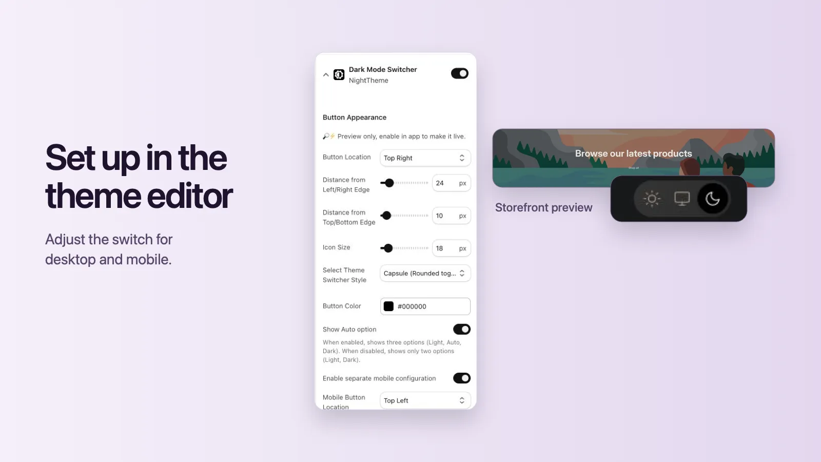
- Turn it on in the theme editor. Your theme files aren’t modified, so theme updates don’t remove it.
- Set the switch position, distance from the edges, icon size, style, and color, with a separate layout for mobile.
- Choose the default mode, and optionally hide the Auto option.
- Dark colors are generated from your existing theme automatically, and you preview the result on your own store before going live.
- Adjust anything that needs it with dark-mode-only CSS, or invert your logo with one setting.
More Shopify dark mode guides
- Shopify Dark Mode: 3 Ways to Add It to Your Store Compare the three ways to add dark mode to a Shopify store: a dark color scheme, a custom-coded toggle, or an app. Includes setup steps and a checklist.
- How to Add Dark Mode to the Shopify Dawn Theme Three ways to add dark mode to Dawn: switch to a dark color scheme, add a light/dark toggle with Dawn's CSS variables, or use an app. Step-by-step with code.
- Logo Disappears in Dark Mode on Shopify? 4 Ways to Fix It A dark logo vanishes on a dark background. Four ways to keep your Shopify logo visible in dark mode: invert it with CSS, swap in a light version, add a backdrop, or use an app setting.